It’s already been more than a year since I launched this site. As I didn’t know at the time how much time and content I wanted to put into the site, I kept it quite simple. I still feel that the design needs to be more about simplifying editing and publishing than having complex functionality.
But as I’ve spent more time adding to the site I’ve felt that some aspects of the design had started to feel a bit out of sync with the content.
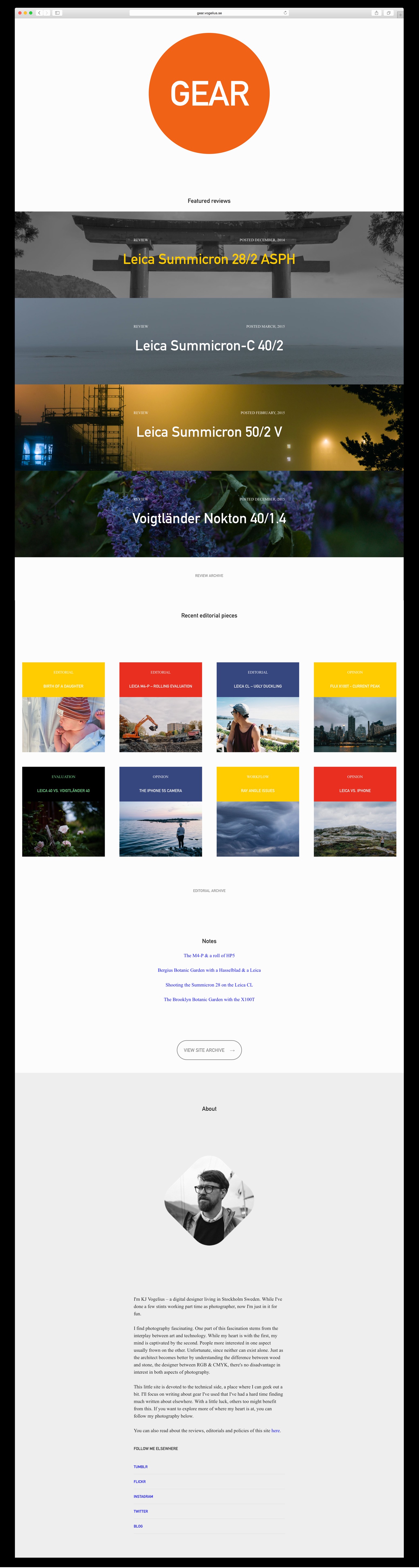
So for the past few weeks I’ve been making some adjustments behind the scenes. Today I’m rolling out the updates. It’s pretty minor, but makes the design feel a bit more finished and a bit better inline with the content I’m adding. The biggest change is a proper logo, as well as a new start page with editorials getting the limelight for a while.
Go ahead and click around the site, you’ll probably feel right at home, but if you miss the old layout you can at least look at this screenshot in remembrance.